All great comic book artists know a few things about creating what readers want to see. Of course, the paneling and art placement is important, but what about the lettering? Lettering comic is the salt and pepper of your comic book – without it, there’s only pictures and no real flavor. Noticeably dominant in all comic books is the capital lettering.
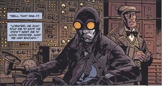
Comic book text is usually capitalized with no serifs (cross bars on the I’s and whatnot), and placed in balloons or boxes. That is the norm for text that is spoken in the comics and actions or back-story are emphasized differently, either with bold lettering or italics. The balloons and boxes have their own importance as well. Different kinds of balloons are used for different actions, there are speech balloons and thought balloons and each one is significant to the different parts of the comic. In addition, there are action words and grammatical symbols to signal speech patterns in text that you wouldn’t be able to experience otherwise. This is truly what makes comic books great.
If you are looking to create your own comic book, comic lettering is important. Capital letters with no flourish or crossbars is the norm. An exception to the rule here is the letter “I”. When using the letter I in a word, it should be written with no serif, however, when used as a singular pronoun, a standard crossbar I should be used. When hand lettering comic books, an artist must be extremely careful to not let some of the letters run together – the “D” must be distinguishable from the “O” and so on. In addition to the lettering being all capitalized letters, emphasis on speech is most important also. The emphasis is bold and italic, and rarely is the text just ever bold or italic, but usually both. Some words are enlarged to show emphasis, such as when a character would be shouting, and and keep to the rules about italics or bold.
Balloon & Boxes
Balloons and boxes are also a big deal. There are several kinds of speech balloons that are used in comic books. A regular speech balloon should be near the speakers head and pointing at him – pointing it in another direction or at a characters hand or other body parts is a faux pas in lettering comic books. If the speaker is behind a door, you can choose to use a star shape at the end of the balloon tail to show that the speaker is “off camera” Burst balloons can be used to show when someone is shouting, and cloud shaped balloons with bubbles trailing afterward are used for a character’s private thoughts. These balloons can be lined with the top of the box or even connect to it – it depends on the artist’s space constraints and what needs to be said. If there is a lot of text to fit into a balloon, some artists will print the text out first, and then draw the balloon around it to save themselves the trouble of trying to fit a lot of lettering into one balloon.
Boxes usually indicate a back-story or captions, displaying more information in the comic that you wouldn’t gain from just looking at the art. Occasionally accompanied by an asterisk, the boxes might indicate another page number or some other important footnote that the reader needs. Things like “time stamps” allusive references dealing with the characters or even narrative speech by one character or another. The words in these boxes are usually italicized, but can be lower case or have drop caps as well.
Symbols & Sound Effects
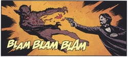
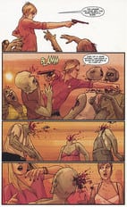
Symbols and sound effects are crucial to comic book art as well. Symbols such as “fireflies” and ellipses are used to show where a character would draw in deep breath or his/her speech would trail off into nothing. This is not the same as using a double dash to show the speech stopping altogether. If you are going to try to make the character mutter or say something under his breath, then you would fit small lettering into a large balloon. Double question marks or ones paired with exclamation points are used to show when someone is shouting a question, and musical notes are used to indicate whistling if alone, and singing when joined with words. In addition to all of this, numbers are to be written out – the only numbers that you would generally see in a comic book are time stamps.
While using sound effects, the idea is the same, although sound effects don’t often come in speech balloons unless people are making them, as with coughing or making other noises. Sound effects like bangs and rattles are written out as they would sound, in colorful and striking text so they are noticeable and dominant – the reader has to know something is making a noise. Sound effect words are designed to pack a punch, and they are often drawn separately from other texts and largely are transparent to the comic so that you can see the art behind it. This is, unless of course the noise is so loud that couldn’t avoid it, and then you might find it to be dark and bold.
The lettering in comic books was once primarily done by hand, and while some use fonts and computers to add text to their art, there is nothing like using a pen to draw out those balloons and add speech to a graphic novel. There are different styles that many different artists use and can be emulated while keeping to the rules that exist for this kind of art. While methods have changed over the years, it’s clear that comic book lettering is an elite job and should be taken with care, lest you lose the comic book feel and end up crossing into no man’s land – comic book readers are specific and know what they like to see when picking up their favorite graphic novel. Bending the rules too much could make your comic book unpleasant to read, but don’t sweat it – the best examples are out there.
Recommended Books
Dc Comics Guide to Coloring and Lettering Comics by Mark Chiarello, Todd Klein & Jim Steranko
This is a great guide for those who would like to get into coloring or lettering comics, but have no idea where to start. In this volume, you’ll learn a little about the theory of coloring comics–how to use color to create a dynamic mood without making the art look clutter. Dozens of full color examples are provided to show the contrast between good color jobs and bad color jobs. Also it provides info on how to create your own fonts for use in lettering. It also provides information on which tools would be useful for computer coloring and lettering. Most of this is done on computers these days, so the appropriate software is recommended. If you already have an idea of which tools you would like to use, it may be better to go ahead a get a guide on the specific software you are going to use if you would like more on the side of technique. If you’re just getting started in the field of comics coloring, this is a great volume to begin with.
Comic Book Lettering: The Comicraft Way by Richard Starkings & John Roshell
Comicraft, the producers of this book, handle a great deal of lettering jobs for Marvel, DC, and other publishers. This book is a great introduction to the methods necessary to creating good digital lettering for comics.
Before Comicraft, most lettering was done by hand, which isn’t as cost-effective for major publishers. Sadly, most publishers are now looking for digital lettering as opposed to manual lettering. However, this doesn’t mean that lettering has to look bad; on the contrary, Comicraft has shown through projects like Astro City and Batman: Hush that digital techniques open up a wide array of new possibilities. This book is a necessity to anyone serious about using digital lettering in their comics. And it’s dirt cheap!
If you are a fan of Wolverine and Jubilee comics, check out the fan fiction written at https://wolverineandjubilee.com/fiction.html.
Submit your review | |